Calm and premium
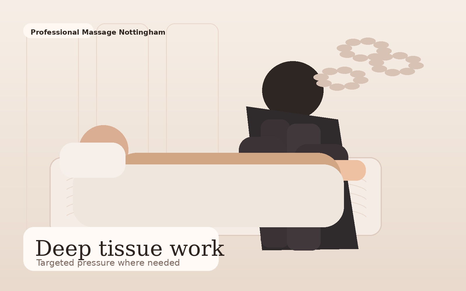
The visual presentation uses warm neutrals, serif headings and spacious layouts to feel feminine, professional and refined.
This page introduces the business in a way that feels warm and credible, without becoming overblown or overly corporate.
The business identity is strongest when it feels local, human and practitioner centred. This layout gives space to tell that story while keeping the page conversion focused.
The visual presentation uses warm neutrals, serif headings and spacious layouts to feel feminine, professional and refined.
The copy keeps a clear local signal so the site works well for nearby search and immediate trust with prospective clients.
WhatsApp, phone and contact form are kept visible rather than making the user work through too many steps.
The final live version can deepen this page with a fuller story, professional background, philosophy, studio details and additional credentials.